
Changelog
List of changes made to the blog
I use this page to document changes made to the blog. It is a way to keep track of the changes and improvements made to the site. Changes are listed in reverse chronological order.
#May 2026
#Social Cards for Every Page
Last month’s per-post social cards covered blog posts, but every other page — the home page, /about, /library, /uses — was falling back to a preview image that didn’t exist, so sharing those links showed a broken card. They now fall back to the site icon, and anything you share from the site renders a proper preview.
#One Header, Two Shapes
Page headers across the site used to live in four near-identical CSS blocks that had drifted apart over time. They now share a single component. Catalog pages like /blog, /categories, and the series and category indexes keep their small kicker above the title (ARCHIVE over Blog, INDEX over Categories). Narrative pages like /about, /colophon, and /uses keep the inverse: title on top, subtitle beneath. The subtitle on those pages drops the italic styling so both header shapes sit on the same baseline.
#On the Nightstand
The /library page used to show only completed and abandoned books. Now there’s an On the nightstand panel above the year grid that surfaces what I’m actively reading, with a softer background, bigger covers, and more breathing room than the year shelves below.
#Stacked Series in the Library
Light-novel runs were swallowing entire year rows on /library — fifteen near-identical “Vol. N” covers in a stack tells you nothing more than one cover and a count. Series whose volumes share generic numbered titles now collapse into a single fanned-cover card per year, with a popover that lists each volume and its rating. Series with distinct titles like The Witcher or The Beginning After the End keep their individual cards.
#Reviews on the Library Shelf
The /library page now surfaces book reviews from Hardcover. Books that have a written review show a small › next to the star rating; clicking the rating opens the review in a popover anchored to it. Books without reviews look exactly the same as before. Modeled on Dave Rupert’s bookshelf.
#Webmentions, More Visible
A new /webmentions page collects every reply, like, repost, bookmark, and mention received across the site, grouped by month. Individual posts also gained a Mentions tab — until now, when someone wrote a blog post about something here, the link sat in the data file and never rendered. The fetcher also stops silently dropping the oldest entries past a thousand, and the site now sends outbound webmentions on a four-hour cron, so any post that links out tells the receiving site about it.
#Tidied-up Categories
The /categories index used to show eighty-odd entries with mixed casing — Setup next to setup, iOS next to ios, plenty of one-off tags from a single old post. I went through every post and consolidated to thirteen lowercase, topic-shaped categories: ios, cli, rails, javascript, css, devops, postgresql, elixir, android, algorithms, leadership, gear, meta. Most posts now have one or two categories instead of five.
#Theme Toggle Sparkle
The header’s theme toggle traded its lightbulb for a moon-and-sparkle pair. The icon shows the destination: a moon when you’re in light mode (click for dark), a sparkle when you’re in dark mode (click for light). Both glyphs pulse gently and respect prefers-reduced-motion.
#April 2026
#Categories Index
A new /categories page lists every topic I’ve written about, ordered by post count. Click any one to see the posts in that category. The link sits in the footer alongside Colophon, Library, and the rest.
#Per-Post Social Cards
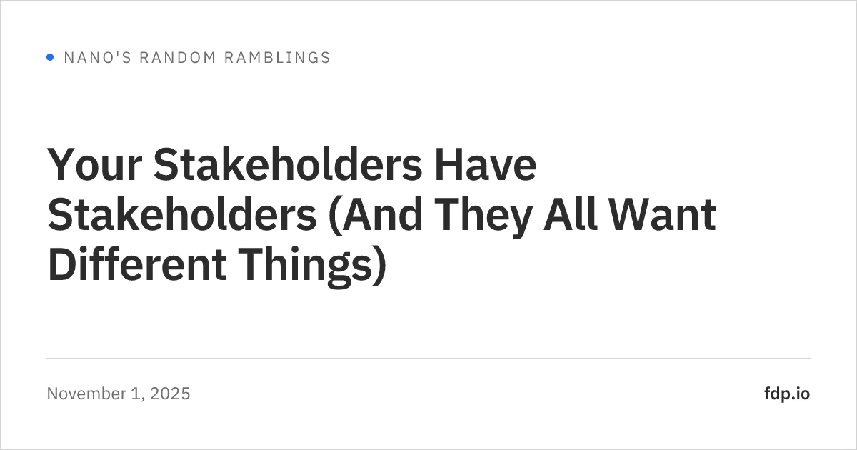
Each blog post now has its own Open Graph image, generated at build time from the title and date. Sharing a post on Bluesky, Mastodon, or anywhere else that reads OG tags shows that card instead of the generic avatar.
#Crossfade Between Pages
Page navigation now uses Astro’s view transitions. Moving between posts crossfades rather than doing a full reload, and the header, footer, and floating back-to-top button stay in place across the swap. Most visible when reading through a multi-part series.
#Refreshed Look
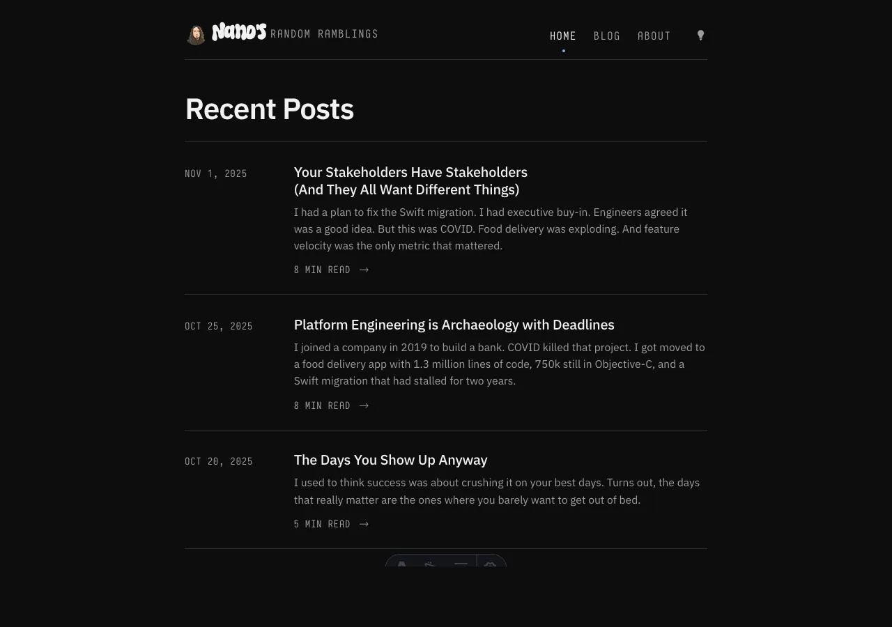
A pretty thorough refresh of the site’s typography, color palette, and layout proportions. The header, post lists, and prose all got reworked. If you’ve been away for a while, it should feel familiar but cleaner.
#Reading Progress Bar
A thin progress indicator now lives at the top of every blog post and tracks how far you’ve scrolled. Mostly useful on the longer posts.
#Code Blocks
Code blocks now show their language in the corner and reveal a copy button on hover. The styling matches the new palette so they feel less like a foreign object dropped into the prose.
#Back to Top
A small floating ornament appears in the corner once you’ve scrolled a bit. Click it to jump back to the top of the page.
#Heading Anchors
Hovering a heading inside a post now reveals a link icon next to it. Clicking it copies the anchor URL — easier to link to a specific section.
#Themed Scrollbar
Even the scrollbar got a coat of paint to match the rest of the palette. A small touch but it stops looking out of place when you’re deep in a long post.
#Refreshed RSS Styling
The XSL stylesheet for the RSS feed was redrawn to match the new look, so the feed has a familiar feel when viewed in a browser.
#Webmention Refresh
The reaction facepile, replies, and mentions list at the bottom of each post got cleaner styling, better avatars, and a selection color that matches the rest of the site.
#Series Disclosure
Multi-part posts use a disclosure list to show their siblings. The expand/collapse animation is smoother now, and item sizing is more balanced.
#Library Resilience
Library entries with long subtitles are trimmed sensibly so cards stay tidy. There’s also a manual override layer for the small set of titles where Hardcover’s data needed a little help.
#November 2024
#Smarter Grouping in Library
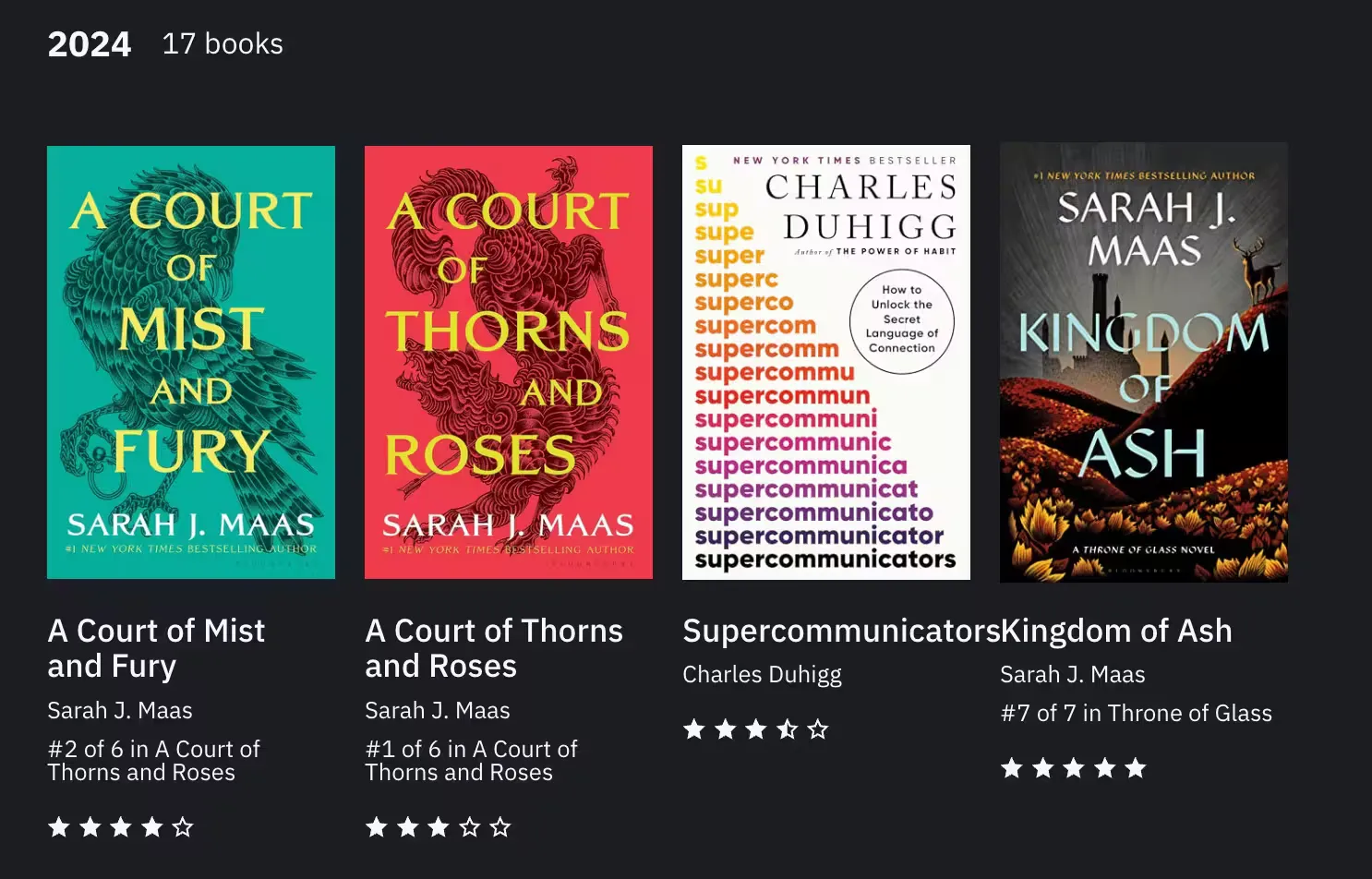
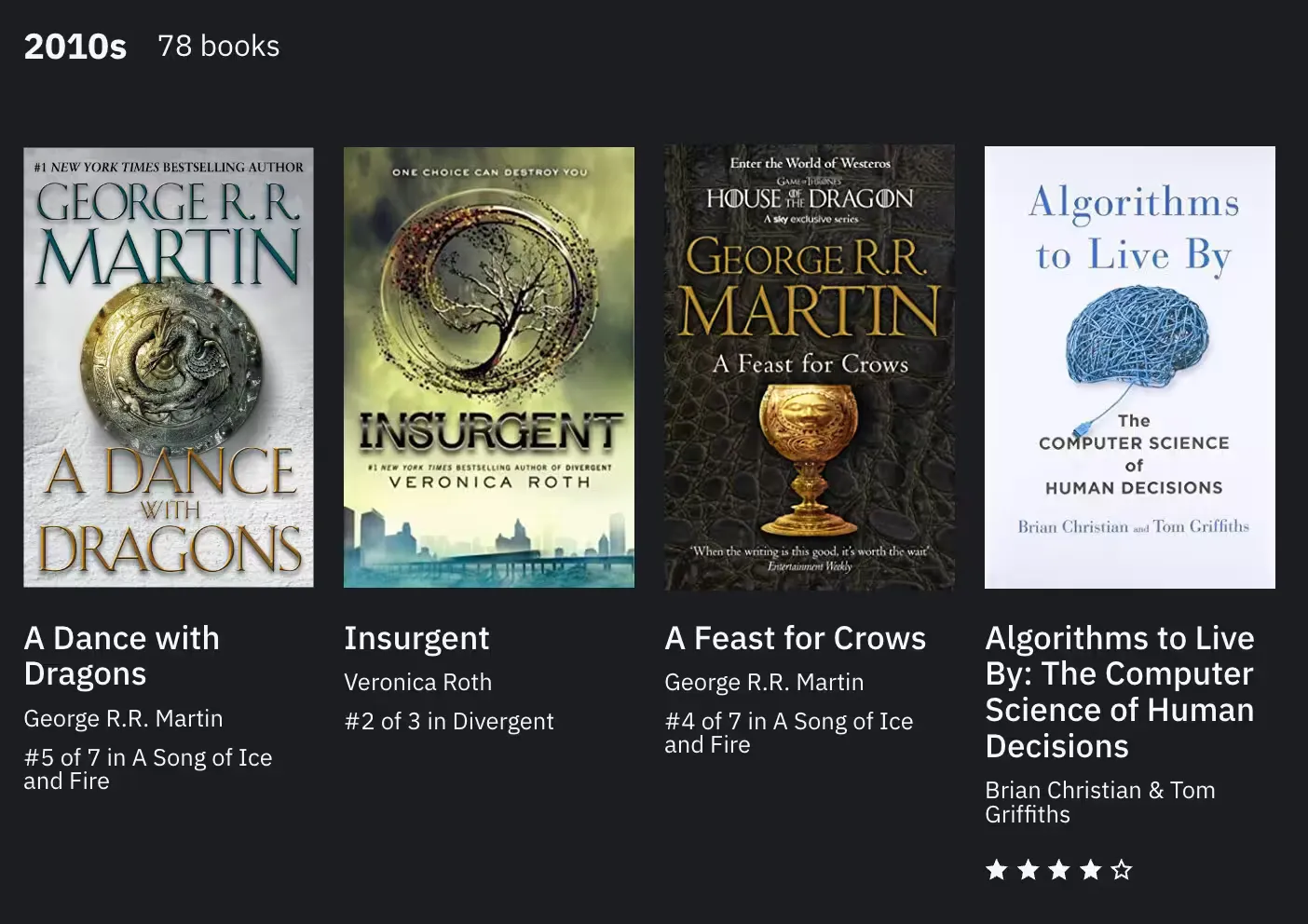
The library was getting very clunky. In part caused by improper cataloging on my side on Hardcover but also due to how few items I had in some years. To work around this, I decided to create a smarter grouping system.
If the book was read in the current decade, it groups by year. If the book was read in a previous decade, then it groups it by decade.
| Year | Decade |
|---|---|
 |
 |
#Bluesky
Add a social icon to footer for Bluesky from remixicon. The footer uses an array for all the social icons, adding it was easy. The only complicated bit was adding css to provide the correct fill color for the svg.
#Abandoned Books
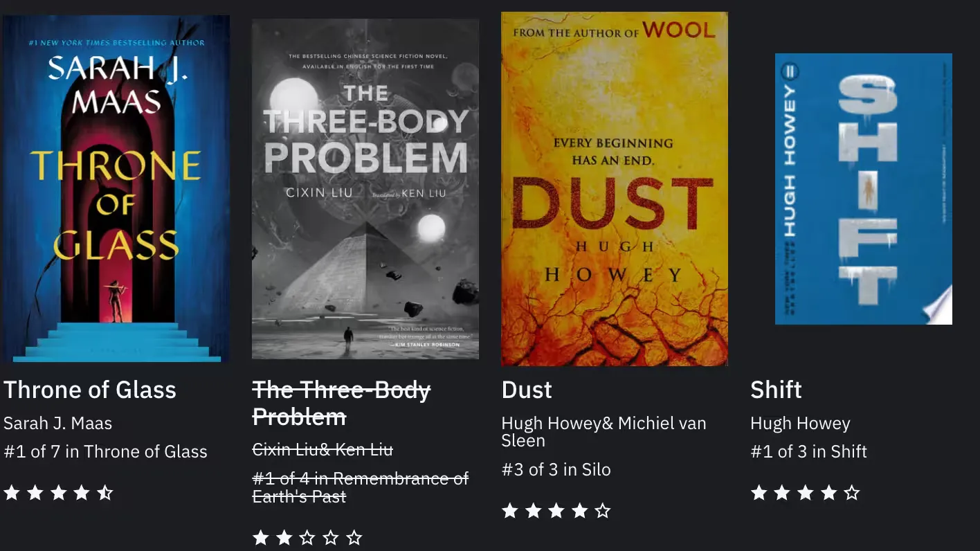
For abandoned books, there’s custom styling to indicate that the book was not finished. The image is desaturated using CSS filters filter, while the title is crossed out using text-decoration.
#Library
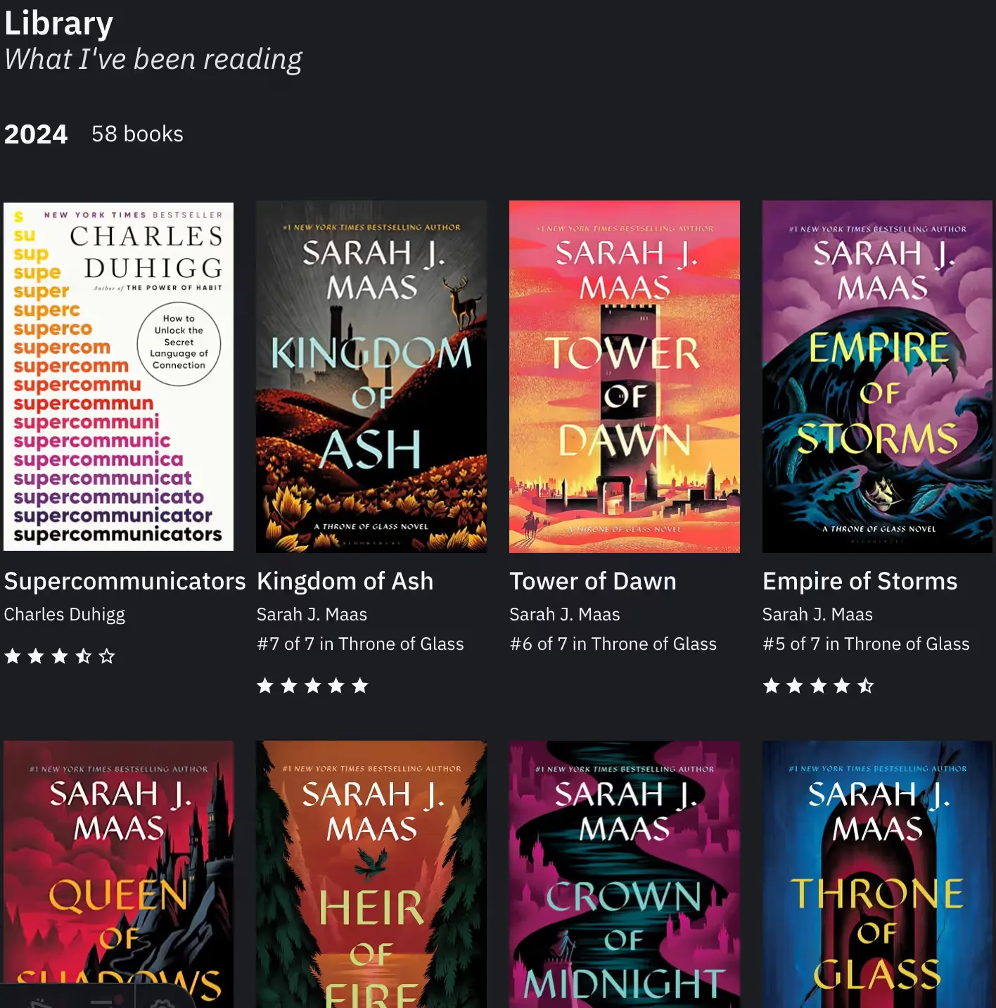
Adds a new library section to the site. It contains a list of books I have read seperated by year. The list is powered by Hardcover and displayed using static data from the Hardcover API to reduce the number of requests. Some of the data still needs to be updated, as I first migrated from Goodreads to Hardcover.
#October 2024
- Update to Astro 4.16
#CSS Updates
- Use CSS Nesting
- Switch to
:where(),is(), andhas()pseudo-class to reduce specificity on base updates - Use logical properties for padding and margin like
padding-blockandmargin-inline. clamp()for font sizes and padding.- Prefer
okclhfor P3-compatible colors
#RSS Feed Styles
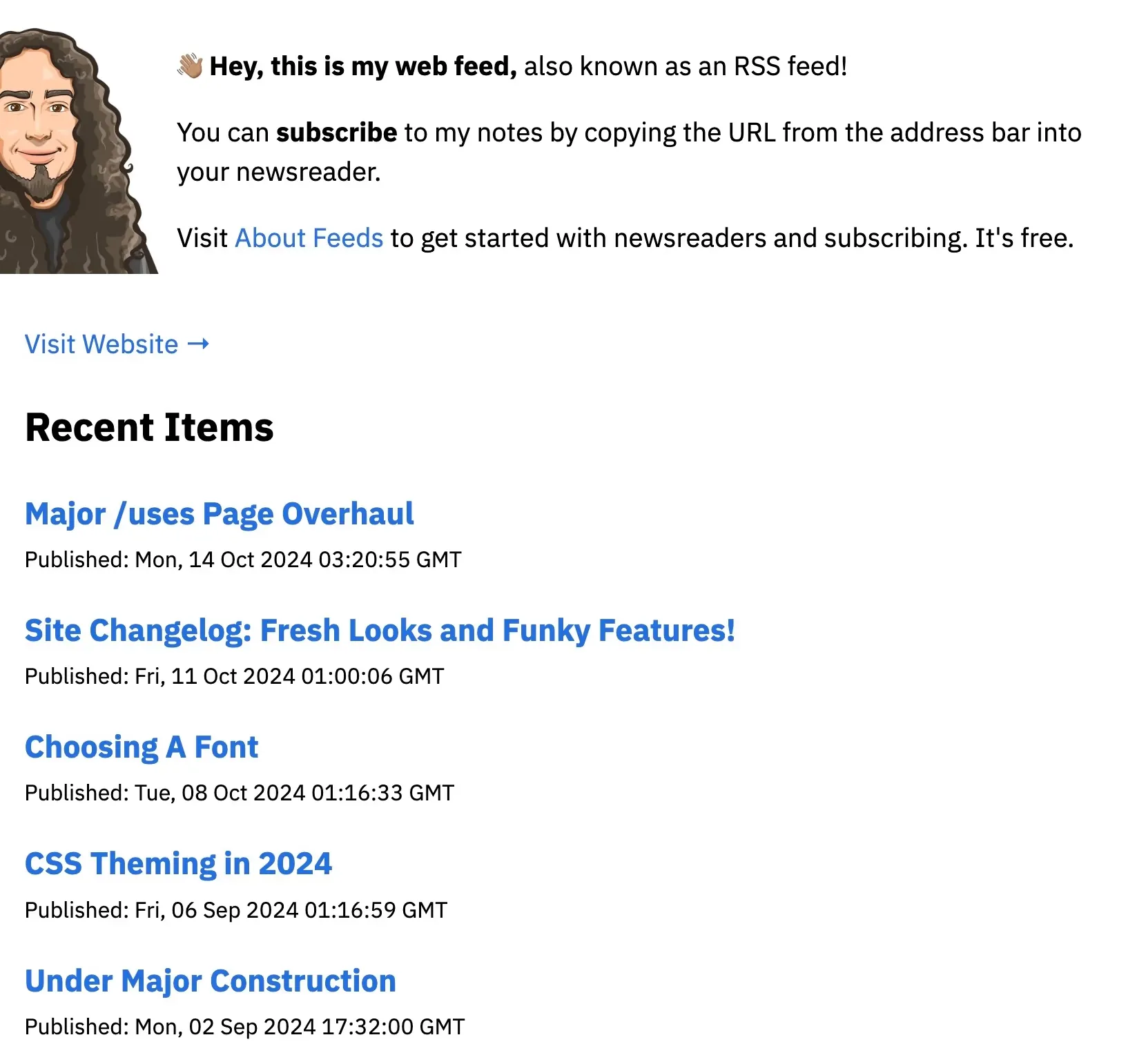
Added new styles for the RSS feed using an XML stylesheet. Following pretty-feed-v3 from genmon/aboutfeeds.
#Series Support

Added support for series in the blog. Now I can group posts together and navigate between them using the series page.