Choosing A Font
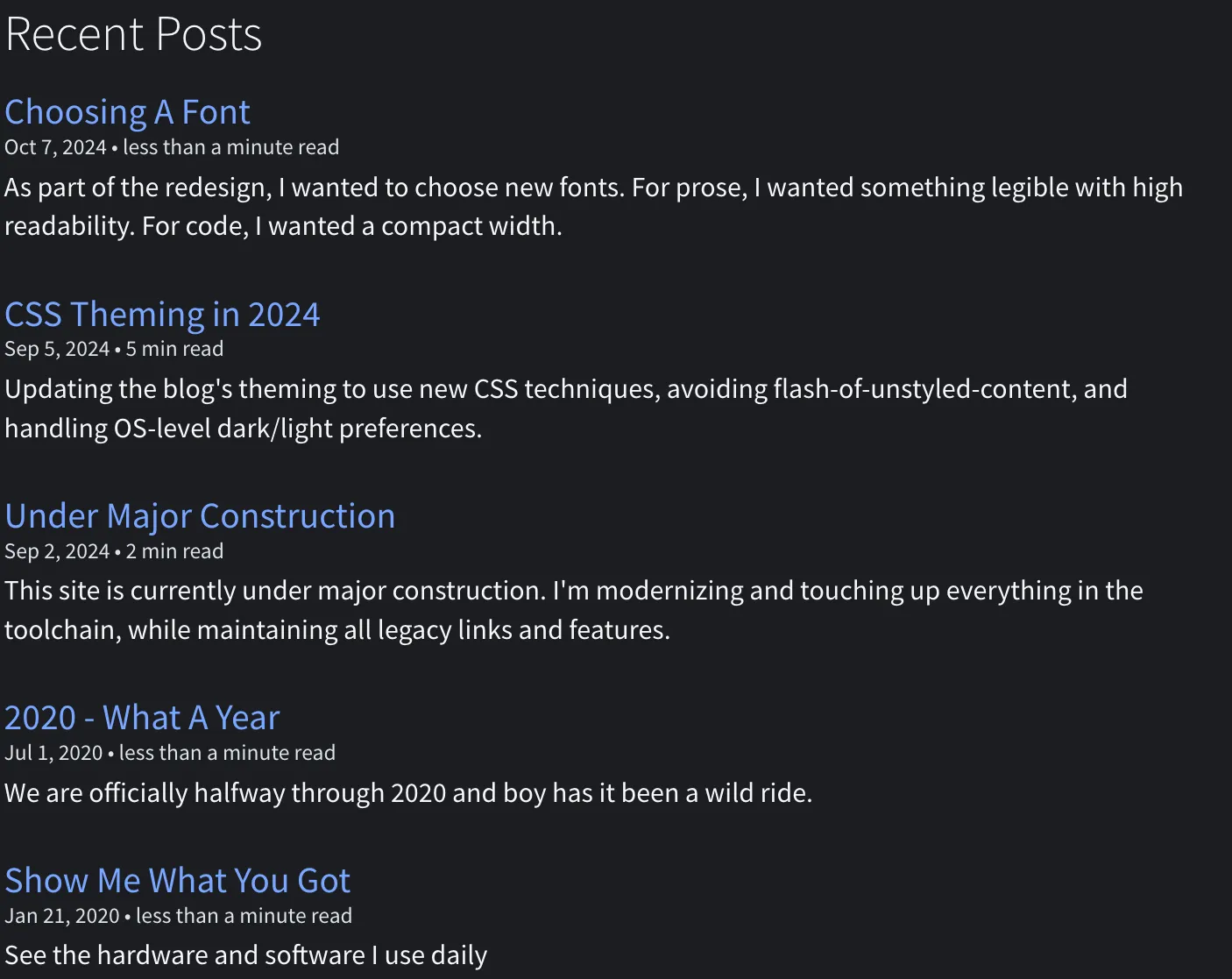
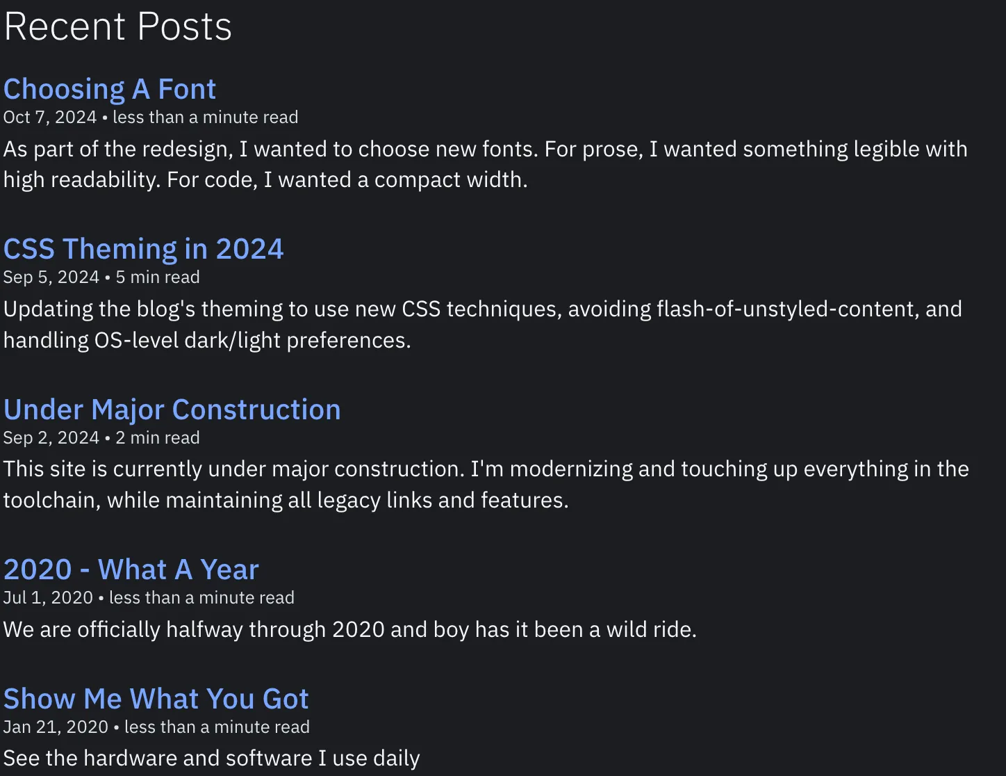
This site has long used custom fonts. In the past, I used Source Sans Pro for prose and Source Code Pro for code. I liked the Source family because it was open-source, had a wide range of weights, and was designed for on-screen reading. However, many new fonts have been released since then, and I wanted to explore my options.
#Prose
For prose, I wanted a font that was highly readable. I wanted a font that was easy on the eyes, with a good x-height, and a generous width. I also wanted a font that was open-source and had a wide range of weights. After much research, I settled on IBM Plex Sans. IBM Plex Sans is a grotesque sans-serif typeface designed by Mike Abbink and Bold Monday. It was designed for on-screen reading and has a wide range of weights. It is also open-source and has a generous x-height.


#Code
For code, I like fonts that are compact with plenty of ligatures. I’ve used Iosevka in the past, for a few years across my various code editors. Iosevka is a slender monospace typeface designed by Belleve Invis. It is also open-source and customizable.
Initially I used the release version of Iosevka, but the size of the font was too large for my liking. Roughly 1.5mb for the regular weight and another 1.4 megabytes for . I wanted to reduce the size of the font, so I decided to make a custom build of Iosevka with the following options:
[buildPlans.IosevkaNano]
family = "Iosevka Nano"
spacing = "normal"
serifs = "sans"
noCvSs = true
exportGlyphNames = false

[buildPlans.IosevkaNano.variants]
  # Curly Style
  inherits = "ss20"

    [buildPlans.IosevkaNano.variants.design]
    zero = "dotted"
    capital-a = "round-top-serifless"
    capital-b = "more-asymmetric-serifless"
    capital-d = "more-rounded-serifless"
    capital-j = "flat-hook-serifed"
    capital-p = "closed-serifless"
    b = "toothless-rounded-serifless"
    d = "toothless-rounded-serifless"
    h = "straight-serifless"
    i = "tailed"
    j = "serifed"
    k = "cursive-serifless"
    l = "serifed-flat-tailed"
    p = "earless-rounded-serifless"
    q = "earless-rounded-straight-serifless"
    at = "compact"
    lig-ltgteq = "slanted"

  [buildPlans.IosevkaNano.ligations]
inherits = "dlig"Iosevka allows you to generate a custom build using a private-build-plans.toml. Iosevka Nano exports into three weights and two styles: Regular, Italic, and Bold. After exporting, the size dropped to around ~500kb per weight. While I was happy with the results, it was still 25x larger than the regular weight of IBM Plex Sans.
I reached for Fonttools to further reduce the size of the font by subsetting. I used pyftsubset to remove unused glyphs and features.
#Subsetting a Font
Subsetting a font is the process of removing unused glyphs and features from a font file. Since I primarily use the font for code, I only need some of the glyphs. I focused primarily on the ASCII characters, punctuation, and a few special characters. I also removed some of the OpenType features that I don’t use.
To get started, I had to install all the tools. On macOS, I used brew to install fonttools and brotli.
brew install fonttools brotliNext, I inspected the font file that I exported from my custom build plan. Wakamai Fondue is a great resource to look at both features and unicode characters. Using Wakamai, I narrowed it down to these ranges:
| Unicode Range | Description |
|---|---|
| U+0020-007F | ASCII characters |
| U+00A9 | Copyright |
| U+00AE | Registered Sign |
| U+00B7 | Middle Dot |
| U+2000-206F | General Punctuation |
| U+2070-209F | Superscripts and Subscripts |
| U+20A0-20CF | Currency Symbols |
| U+2100-214F | Letterlike Symbols |
| U+217D-217E | Small Roman Numerals |
| U+2190-21FF | Arrows |
| U+2212-22FF | Mathematical Operators |
| U+FB00-FB4F | Alphabets for the Arabic Script |
Arguably, I don’t need all of these characters, but I wanted to keep the font as flexible as possible. To subset our font, we take the ttf file and run it through pyftsubset. Here’s an excerpt from the script I run that takes in any font file and outputs a woff2 file in my font directory:
pyftsubset "$1" \
  --output-file="public/fonts/$basename.woff2" \
  --flavor="woff2" \
  --layout-features="*" \
  --unicodes="U+0020-007F, \
              U+00A9, \
              U+00AE, \
              U+00B7, \
              U+2000-206F, \
              U+2070-209F, \
              U+20A0-20CF, \
              U+2100-214F, \
              U+217D-217E, \
              U+2190-21FF, \
              U+2212-22FF, \
U+FB00-FB4F"The end result was a font file that was only 70kb per weight. Given that Iosevka has a host of different glyphs compared to IBM Plex Sans, I was happy with the results, even if it still was almost 3x the size. From the 3 megabytes for two weights, I was able to reduce the size to 210kb across all three weights 🎉
A summary of the sizes:
- Original Size: 1.5 MB per weight
- Custom Build Size: ~500 KB per weight.
- After Subsetting: 70 KB per weight.
#Conclusion
Choosing the right font goes beyond aesthetics; it significantly affects readability and user engagement. Switching to IBM Plex Sans and a customized Iosevka not only improved the visual appeal of my site but also enhanced the reading experience.
As I continue to refine the design, I’m excited to see how these choices influence user interaction and overall satisfaction.
No comments yet. Share on Mastodon and see your comment or write a post on your blog if you support Webmentions
No reposts yet. Share on Mastodon and see your repost or write a post on your blog if you support Webmentions
No likes yet. Share on Mastodon and see your like or write a post on your blog if you support Webmentions
No bookmarks yet. Share on Mastodon and see your bookmark or write a post on your blog if you support Webmentions
Powered by Webmentions